Thursday, April 28, 2016

Writing 5(blog posts) for Crit 4

Last time it was suggested that, in order to add a bit more context and clarity to the world these characters live in, that I should include environment shots with the next batch of character designs. Not gonna lie, I really hate drawing scenery. I get frustrated with it easily. But I buckled down a couple weeks back and made myself practice. Here are the two I'm bringing to Critique (In rough stages):


This first one shows the New York City skyline as it looks after the merging of our world and the fantasy world. It was my hope that this would show my idea of how the worlds spliced together, and the dire consequences it sometimes had. In this world, it's fairly common to see the skeleton of some poor creature or human sticking out of an object or wall. This is due to that poor being's bad luck of being in the wrong place during the merging.

The second shows a coffee shop owned and run by fairies. In this world, there are many different fantastical races, and I wanted to show them mingling with modern humans to show how the two worlds integrated.

As for my character designs, I'm bringing three more.


The first one is Dagny, a faun who has the element of earth living inside her. She's very quiet and naive, but fiercely loyal.


 Tyler is the vessel for the Water element, and being of an artistic persuasion he has learned how to use his talent to work in watercolors.

Even though I'd drawn Cyth recently, I wanted to draw him again after he becomes the vessel to the wind element. His zipper eye was also pretty hard to see in the last picture, and I wanted an excuse to draw it. It's fun. :)

For my classmate highlight this blog entry, I'd like to direct your attention to Robbie Raio:
https://robbyraio.wordpress.com/2016/02/04/crit-three-introduction/
He's super talented with ceramics and jewelry making, and has a great sense of humor. He just recently started combining wire-wrapping techniques with ceramics, and it looked really cool. Hopefully he keeps pursuing that new combo.

Writing 5(blog posts) for Crit 4

My last critique held some really good feedback. I got great reviews on my tanky demon, with people saying they could really 'feel' like he was three-dimensional. For my last critique, I've decided to design four essential characters for my story, using what I've learned over this semester.

Here are my versions of the Four Horsemen of the Apocalypse:

  
Pestilence - The White Horse    
Starting with Pestilence, I was inspired by the plague doctor masks made infamous during the black death. I wanted to have a very limited color palette, so as to avoid the 'children's book illustrations' feel that some of the other monsters had when I used watercolors. I used copic markers instead, in very small areas to draw attention to them.
War - The Red Horse
 War was my favorite to draw, as its horse body is based on a Clydesdale, which is one of my favorite types of horse. Again, I wanted to have a very limited color palette.
Famine - The Black Horse
 Famine was not a fun design to do research for, since I had to look up what emaciated horses look like. I'm pretty pleased with this design, though.
Death - The Pale Horse
I didn't want Death to be 'in your face' scary, but maybe a bit more subtle.  I also didn't want it to be a stereotypical skeletal horse, since that's always what I see this Horseman shown as. When I looked up the original Bible verse, it describes Death as riding a pale horse, which could also mean grey, so I gave it the frame of an Arabian horse and slight dappling. The design for the scythe was loosely based on a Stephen Gammell illustration:
Stephen Gammell - "Bess"
I decided to make them all centaurs since I'd never seen that done with the Horsemen of the Apocalypse. I guess it's just a much more literal interpretation of "horsemen." :)

I'm really excited to see what everyone else has brought for the final critique, and I'm interested to hear what people think of the Horsemen I designed. I'm also looking forward to seeing what Darah Dawn Miller has brought, as I find her art style really interesting. You can find her blog here:
https://darahdawnmiller.wordpress.com/2016/04/07/writing-4-blog-posts-for-crit-3/
That clay octopus is one of my favorite pieces she's brought so far. The mouth that's visible faintly reminds me of Ukio-e prints, and I wonder if she's ever thought about continuing that motif. It could look really cool.

Thursday, April 21, 2016

Writing 6 (blog posts) Artist Lecture

Sarah Perkins, "Winged Container"


What first struck me about Sarah Perkins's work was the graceful nature of her sculpting and metalwork. At first I thought it was ceramic, but was surprised to learn that it was mainly metal. The above pictured vessel was one of my favorites she showed. I love how the colors transition from blue to brown, it produces a very soothing effect. I also like how the silver stands out from the blue, and how swirly the designs around the brim are. During the Q&A session she mentioned that she started out with jewelry in High School and it shows with intricate designs like the swirls. During her talk she said she was inspired by nature and the world around her, and I can definitely see where that influence comes in with pieces like this:

Sarah Perkins, "Cactus Container II"


Her work has such a great tactile sense to it, I really want to pick it up and touch it. She said she sometimes achieves this effect by taking the gloss out of her final products, as she usually finds pieces with a high amount of gloss uninviting. She said her work was about a mixing of human and organic (straight lines vs. curvy, etc.). An example of that concept is shown in this piece:

Sarah Perkins, "Orchid Vessel"
The Orchid Vessel mixes straight, rigid lines with the softer, organic shapes of the top rim. She says she's really drawn to the form of the vessel. Another thing she mentioned interest in was the concept of 'ritual' things, and how they can be intriguing and also make one feel like an outsider if the object's purpose is unknown. She cited many trips to churches, mosques, and other places of worship and mentioned how interested she was by the ritual objects displayed there. Taking that inspiration, she creates works like this:

Sarah Perkins, "Rosewater Itradan"
In the vessel (Called an Itradan), there is usually some kind of liquid (In this case rose water). And each cup has a special pigment in it. Each cup means something, and even if it's not known what they're still interesting to look at. Ms. Perkins has actually made several series of cups which she says she wanted to be, "Similar, but not identical."

Ms. Perkins ended her talk by speaking briefly about Cairo, Indiana. Cairo is a town by a river that has fallen by the wayside and into deep disrepair. Perkins has teamed up with another artist, Gwen Walstrand, to produce a series of work based on photos taken of the town. Perkins's contributions consist of large bowls with scenes from or inspired by the town re-created on them.

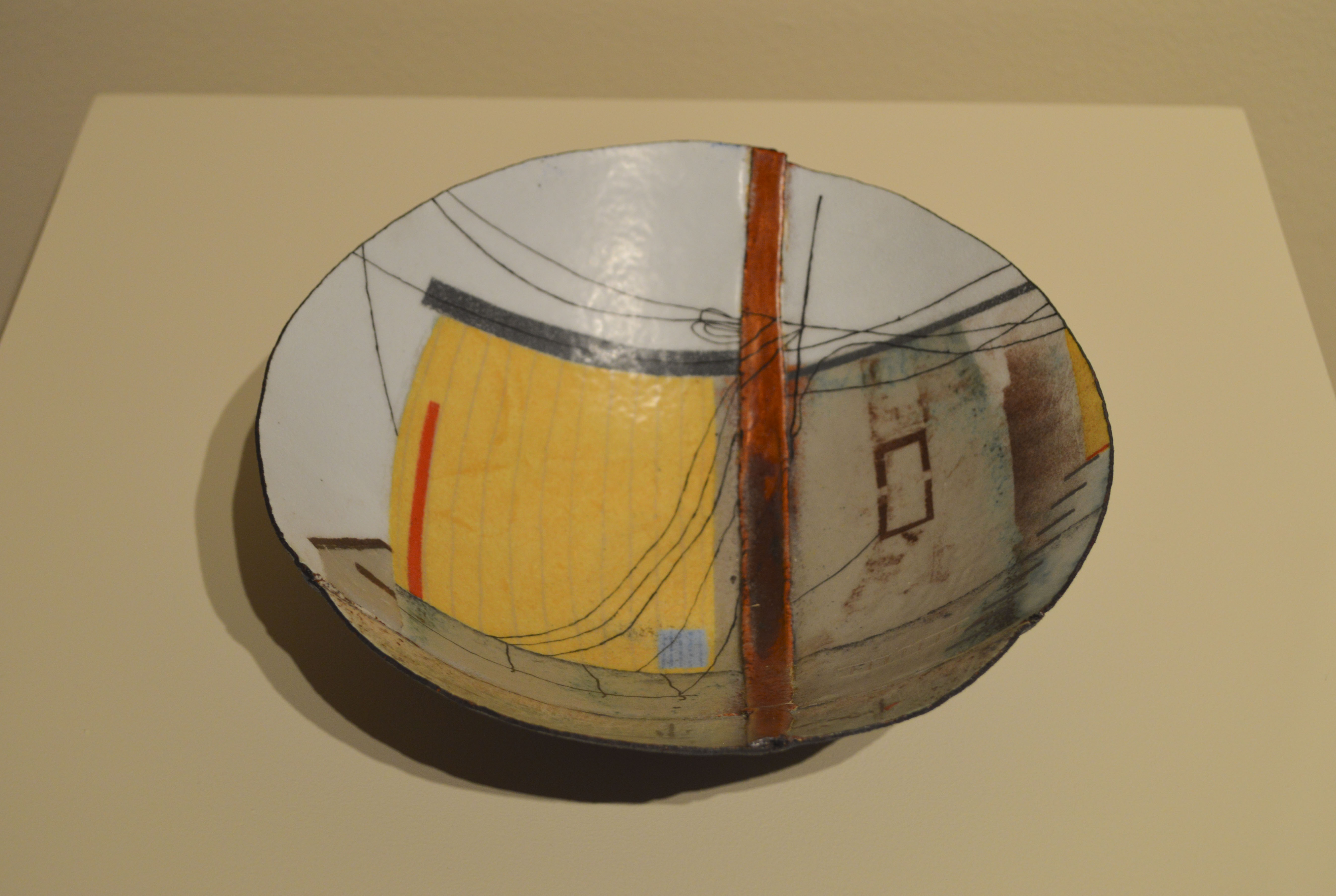
Sarah Perkins, title unknown
Sarah Perkins was fun to listen to, and seems like a very lively person. Her work was very nicely presented and her powerpoint was simple, and uncluttered. Therefore it was very easy to follow and did lend a more professional feel to her presentation. I looked at her website to see more of her work, and among other pieces in her gallery I think I found my favorite:

Sarah Perkins, "Black Lined Container"
I really like how smooth this one is, and I've always been a fan of black, silver, and blue together. The blue enamel against the black is so pretty, and it's just enough to make it a wonderful accent color. I've always loved containers, finding that the more ornate they are that they often hold a greater degree of mystery. While this vessel is far from the most ornate that Perkins has produced, to me it's the most intriguing.

Thursday, April 7, 2016

Writing 4(blog posts)for Crit 3 (Crit II)

I got some good feedback last time, and I think part of it was that the group was good about keeping in mind that the demons were meant to be seen as designs, and not finished art pieces. Portico suggested I try doing a bit more gore; having the demons have some "evidence" of their activities. So, here are the three I've got to show on Friday:

I wanted to draw a big tanky demon, with some influence from Stephen Gammell's work. Since last time it was mentioned that the color made my demons almost 'cute' I wanted to try black and white with some sparse color.
 My second design was prompted by wanting to do something a bit more human looking, but still unsettling. I used the same coloring idea as I did in the first design.

Taz is actually going to be a pretty important character in my webcomic, which is why I put a bit more work into coloring him. In the story, he's a fallen angel who is a member of a small band of demons who want to seek redemption and be allowed back into Heaven. When he initially shows up in disguise at the main character's house, they reveal his true form and try to trap him. Unfortunately all they have on hand when they work the spell is a Gatorade bottle. So he gets shrunk down to that size. Eventually, once he proves that his intentions are good, they'll put him in an old turtle habitat so he has a bit more room to roam.

I'm really curious to hear feedback on the first demon, as I tried a few new inking techniques with it. 

This time around I'd like to feature Will Cowley:
https://willcowley.wordpress.com/2016/01/29/information-about-myself/

I really like that his work has elements of stage magic in it, as I've always been a fan of that. I don't see any examples of it on his latest blog post, but the last couple of critiques he's brought in drawings of little voodoo dolls that are creepy cute.  I wonder if he's ever thought about taking one of those voodoo doll drawings and turning it into a sculpture? I think some of his works could look really cool in that format.