Showing posts with label Homework. Show all posts

Wednesday, May 4, 2016

Writing 5 (blog posts) Artist Lecture

"Zoe - Age 8" By Gwen Walstrand


Gwen Walstrand's work in photography mainly deals with portraiture. She showed us many series of her work, but the ones that stood out to me most were those she titled "Between." They consisted of photos of preteens, and a few kids who were slightly older or younger than that range. Something about the way she photographed them really captured that feeling of being a preteen. The one that stood out to me the most from that series is:

"Elizabeth" by Gwen Walstrand
Just something about this portrait really jumps out at me. I think it might be how much the darker background makes the pale girl stand out that much more. She's also so thin and fragile looking, yet seems to have some sort of strength about her face. I usually don't care for portrait photography, but this one really stuck in my mind. I also really liked her series of photos from Italy:

"Italia - 102" By Gwen Walstrand
Ms. Walstrand has a knack for conveying personality and character with her subjects. As for her work with Ms. Perkins,  Ms. Walstrand said that the town was "...Interesting, it's like everyone walked out all at once." During her talk she told us more about how racial tensions had destroyed the town. Many violent acts had occurred there, including a lynching. This fighting destroyed the town and left it as the shell it is today. Ms. Walstrand did take some interesting photos of the town, but I didn't find any of them as engaging as her portraiture.

She said she was inspired by searching, the unknown, navigation both physical and spiritual, and said that it was likely a reaction to her strict religious upbringing. She also recommended a book called "A Field Guide to Getting Lost" by Rebecca Solnit. I've googled the title and it looks like a book I might have to check out once everything settles down from finals and graduation.

Thursday, April 28, 2016

Writing 5(blog posts) for Crit 4

Last time it was suggested that, in order to add a bit more context and clarity to the world these characters live in, that I should include environment shots with the next batch of character designs. Not gonna lie, I really hate drawing scenery. I get frustrated with it easily. But I buckled down a couple weeks back and made myself practice. Here are the two I'm bringing to Critique (In rough stages):


This first one shows the New York City skyline as it looks after the merging of our world and the fantasy world. It was my hope that this would show my idea of how the worlds spliced together, and the dire consequences it sometimes had. In this world, it's fairly common to see the skeleton of some poor creature or human sticking out of an object or wall. This is due to that poor being's bad luck of being in the wrong place during the merging.

The second shows a coffee shop owned and run by fairies. In this world, there are many different fantastical races, and I wanted to show them mingling with modern humans to show how the two worlds integrated.

As for my character designs, I'm bringing three more.


The first one is Dagny, a faun who has the element of earth living inside her. She's very quiet and naive, but fiercely loyal.


 Tyler is the vessel for the Water element, and being of an artistic persuasion he has learned how to use his talent to work in watercolors.

Even though I'd drawn Cyth recently, I wanted to draw him again after he becomes the vessel to the wind element. His zipper eye was also pretty hard to see in the last picture, and I wanted an excuse to draw it. It's fun. :)

For my classmate highlight this blog entry, I'd like to direct your attention to Robbie Raio:
https://robbyraio.wordpress.com/2016/02/04/crit-three-introduction/
He's super talented with ceramics and jewelry making, and has a great sense of humor. He just recently started combining wire-wrapping techniques with ceramics, and it looked really cool. Hopefully he keeps pursuing that new combo.

Writing 5(blog posts) for Crit 4

My last critique held some really good feedback. I got great reviews on my tanky demon, with people saying they could really 'feel' like he was three-dimensional. For my last critique, I've decided to design four essential characters for my story, using what I've learned over this semester.

Here are my versions of the Four Horsemen of the Apocalypse:

  
Pestilence - The White Horse    
Starting with Pestilence, I was inspired by the plague doctor masks made infamous during the black death. I wanted to have a very limited color palette, so as to avoid the 'children's book illustrations' feel that some of the other monsters had when I used watercolors. I used copic markers instead, in very small areas to draw attention to them.
War - The Red Horse
 War was my favorite to draw, as its horse body is based on a Clydesdale, which is one of my favorite types of horse. Again, I wanted to have a very limited color palette.
Famine - The Black Horse
 Famine was not a fun design to do research for, since I had to look up what emaciated horses look like. I'm pretty pleased with this design, though.
Death - The Pale Horse
I didn't want Death to be 'in your face' scary, but maybe a bit more subtle.  I also didn't want it to be a stereotypical skeletal horse, since that's always what I see this Horseman shown as. When I looked up the original Bible verse, it describes Death as riding a pale horse, which could also mean grey, so I gave it the frame of an Arabian horse and slight dappling. The design for the scythe was loosely based on a Stephen Gammell illustration:
Stephen Gammell - "Bess"
I decided to make them all centaurs since I'd never seen that done with the Horsemen of the Apocalypse. I guess it's just a much more literal interpretation of "horsemen." :)

I'm really excited to see what everyone else has brought for the final critique, and I'm interested to hear what people think of the Horsemen I designed. I'm also looking forward to seeing what Darah Dawn Miller has brought, as I find her art style really interesting. You can find her blog here:
https://darahdawnmiller.wordpress.com/2016/04/07/writing-4-blog-posts-for-crit-3/
That clay octopus is one of my favorite pieces she's brought so far. The mouth that's visible faintly reminds me of Ukio-e prints, and I wonder if she's ever thought about continuing that motif. It could look really cool.

Thursday, April 21, 2016

Writing 6 (blog posts) Artist Lecture

Sarah Perkins, "Winged Container"


What first struck me about Sarah Perkins's work was the graceful nature of her sculpting and metalwork. At first I thought it was ceramic, but was surprised to learn that it was mainly metal. The above pictured vessel was one of my favorites she showed. I love how the colors transition from blue to brown, it produces a very soothing effect. I also like how the silver stands out from the blue, and how swirly the designs around the brim are. During the Q&A session she mentioned that she started out with jewelry in High School and it shows with intricate designs like the swirls. During her talk she said she was inspired by nature and the world around her, and I can definitely see where that influence comes in with pieces like this:

Sarah Perkins, "Cactus Container II"


Her work has such a great tactile sense to it, I really want to pick it up and touch it. She said she sometimes achieves this effect by taking the gloss out of her final products, as she usually finds pieces with a high amount of gloss uninviting. She said her work was about a mixing of human and organic (straight lines vs. curvy, etc.). An example of that concept is shown in this piece:

Sarah Perkins, "Orchid Vessel"
The Orchid Vessel mixes straight, rigid lines with the softer, organic shapes of the top rim. She says she's really drawn to the form of the vessel. Another thing she mentioned interest in was the concept of 'ritual' things, and how they can be intriguing and also make one feel like an outsider if the object's purpose is unknown. She cited many trips to churches, mosques, and other places of worship and mentioned how interested she was by the ritual objects displayed there. Taking that inspiration, she creates works like this:

Sarah Perkins, "Rosewater Itradan"
In the vessel (Called an Itradan), there is usually some kind of liquid (In this case rose water). And each cup has a special pigment in it. Each cup means something, and even if it's not known what they're still interesting to look at. Ms. Perkins has actually made several series of cups which she says she wanted to be, "Similar, but not identical."

Ms. Perkins ended her talk by speaking briefly about Cairo, Indiana. Cairo is a town by a river that has fallen by the wayside and into deep disrepair. Perkins has teamed up with another artist, Gwen Walstrand, to produce a series of work based on photos taken of the town. Perkins's contributions consist of large bowls with scenes from or inspired by the town re-created on them.
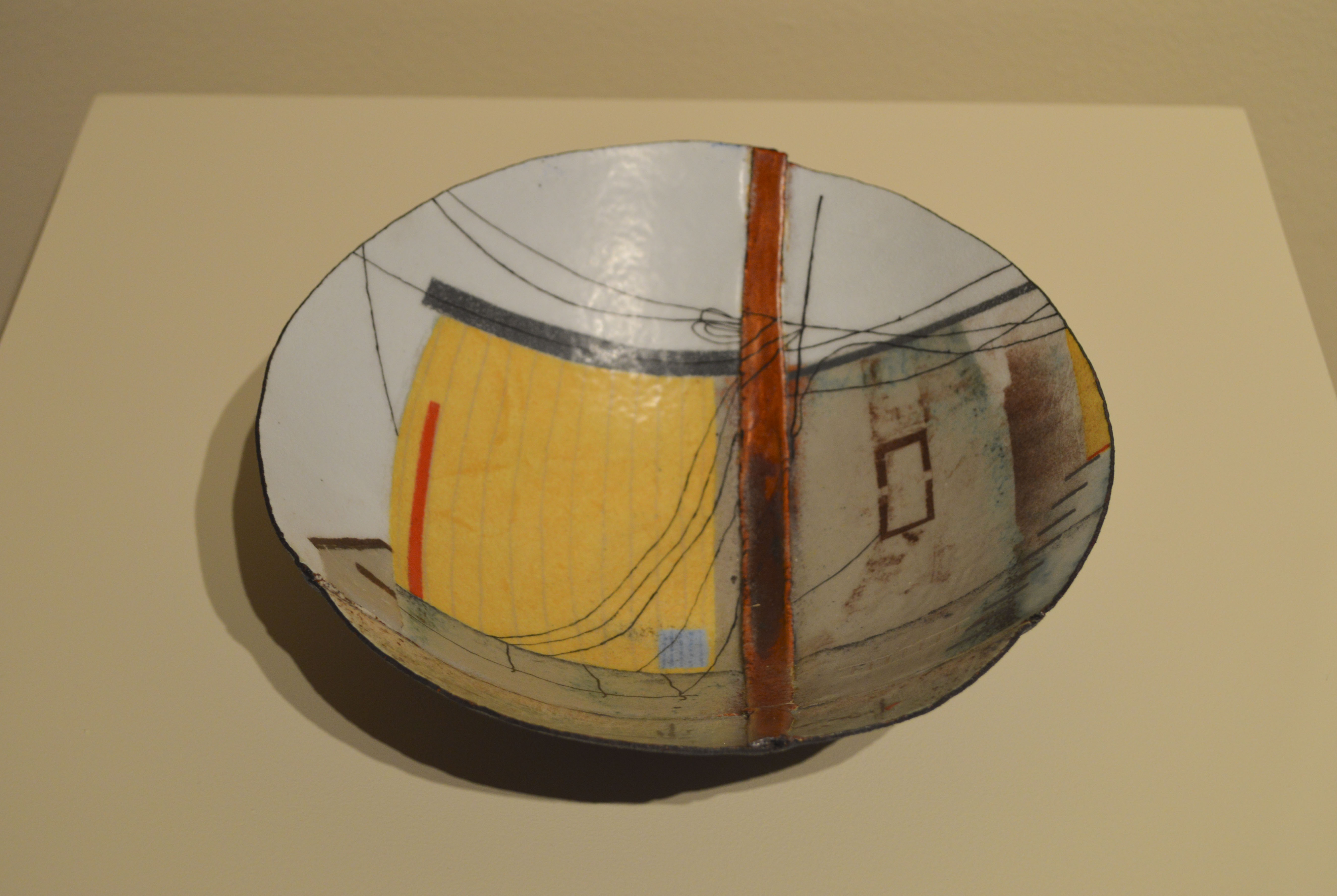
Sarah Perkins, title unknown
Sarah Perkins was fun to listen to, and seems like a very lively person. Her work was very nicely presented and her powerpoint was simple, and uncluttered. Therefore it was very easy to follow and did lend a more professional feel to her presentation. I looked at her website to see more of her work, and among other pieces in her gallery I think I found my favorite:

Sarah Perkins, "Black Lined Container"
I really like how smooth this one is, and I've always been a fan of black, silver, and blue together. The blue enamel against the black is so pretty, and it's just enough to make it a wonderful accent color. I've always loved containers, finding that the more ornate they are that they often hold a greater degree of mystery. While this vessel is far from the most ornate that Perkins has produced, to me it's the most intriguing.

Friday, November 20, 2015

Research Blog Post 3 (Context & Analyzing, Interpreting the data, Reporting and Evaluating Research)

Ultimately I'm limited in my scope of this project, since I wouldn't be able to travel to any large cities to get a bigger sample of opinions. However, any direction would help me in my future monster designing endeavors.

By figuring out what traits make a monster scarier than others to a large group of people, I can design more terrifying monsters and hopefully enhance the feeling of danger in my webcomic. Once I've established which set of traits rank among the top most terrifying, I can pick and choose which traits I'll incorporate into which design. I'm not going to limit myself to solely these traits when drawing monsters. Each monster may have one or two of the scariest traits, but for the sake of variety I'd switch it up and keep things fresh for my readers. The monsters they should feel more threatened by might have more of these traits than less important monsters.

Sunday, April 26, 2015

Writing 5(blog posts) for Crit 4

At critique 3 I ended up showing the two images I posted last time, plus getting color feedback on two more that I didn't. I received a lot of positive feedback on them and a few suggestions. One of them was that I should try to push the story of my work farther, like giving the little girl a ferocious, rearing, monstrosity rather than the stoic horse-dragon. While I'm going to keep that piece as-is, I'll definitely try to push myself more in future pieces.

In the aftermath of my senior art exhibit, I haven't been doing much work (the few weeks before it were so insanely busy, I feel pretty burnt out). However, I need to start working on fanart for the two conventions I'll be doing this year. I've also got the 4th and final critique this week.

I have been doing some work since the show that I've found fun. I took the look and feel of old 50's Pinup girls and applied it to traditional fantasy races (Elves, dwarves, Drow, etc.). I also love clothing from that era. Right now I've got 2 versions of a Mermaid. I'm keeping their physical form fantastical, but basing the clothing on fashions of that era.

Two artists that I'm really looking to for inspiration are Gil Elvgren, and Duane Bryers. I love classic Pinup girls, because for the most part they are sexy, but still retain a certain amount of class that I really like. I'm also going to push myself and try to do them lineless and more painterly, to better mimic Mr. Elvgren's style. I'd also like to incorporate the humor of Bryers's work in some of my pieces, as well.

Here are some of Duane Bryers's works:


Here is some of Gil Elvgren's work:


As for my classmates, another whose work I'd like to highlight is Emily Westhoff. She paints a lot of pastoral scenery, and loves to depict the wide open spaces of midwestern prairies:


http://emilyrosepainting.blogspot.com/


Monday, April 6, 2015

Writing 4(blog posts)for Crit 3

Last critique went pretty well. I got a lot of positive feedback on my eight comic pages, along with some suggestions for reference materials to look at. My next critique is coming up on Friday, and I'm rushing to get things ready. I've got two pieces to show so far, and I'd like to get two more done. Here are the two I finished recently:

This one shows a character of mine named Samhain that I haven't drawn for awhile. Recently I've been going back and reworking his story to be more suited to an adult audience. Samhain has a being inhabiting him called either "Black Ether" or "Azrael" and it gives him powers over death. He helps the recently deceased cross over in his dreams.

This is the second piece I finished. Originally I drew this with no particular character in mind, but then my boyfriend pointed out how the little girl reminded him of one of our Pathfinder characters' daughters. So I made the little girl into her and I really like how it came out. She has a talent for bringing home unusual creatures. :)


Here's one of my classmate's blogs. She's also a commercial art student and has recently been doing a lot with photography and drawing. Check out her work here:


Friday, April 3, 2015

Writing 6 (blog posts) Artist Lecture


Yesterday I went to Ariel Bowman's artist talk. Ever since seeing her art I'd been curious as to how she made it. Here is some of her work:

Out of all of the pieces displayed in Porter Hall right now, my favorite is this one:

 I like how precariously balanced the elephants are. Also the fact that they're different species of ancient elephant is very cool.

For her lecture, Ms. Bowman used a projector and powerpoint presentation. Not only did she show pictures of her finished work, but she showed in-progress shots that explained how she made her art. She also included pictures of people whose work had inspired her, which I hadn't thought of doing but might consider for my final lecture.

Tuesday, March 10, 2015

Writing 3 (blog posts) for Crit 2

So, we had our first critique awhile ago. It was fun to finally see so many of my classmates' works in person. As for my own work, I think the ten comic pages I did went over well. Jamie had a couple comments about a few panel compositions and some suggestions for changes that I intend to follow. My classmates said they really liked how I drew my characters' hair and expressions. There were a couple anatomy errors that they noticed, some of which I knew about and others that I hadn't. Glad the latter got pointed out. :D

For this upcoming critique, I'll be bringing eight pages of a different idea for a webcomic. I'm trying to pay closer attention to anatomy (which is proving tricky with a character that has animal anatomy, something I'm not used to drawing). I'm also trying to come up with more interesting compositions. Another new thing for me to puzzle over is how to convey action in a comic. I've never done fight scenes before, and trying to show movement in a still picture is very difficult for me.  Here are a couple preview images:


For the creatures in this webcomic, I'll be drawing a lot of inspiration from horror-based sources, but particuarly from Stephen Gamell, who is best known for his child traumatizing illustrations in the "Stories to tell in the dark" series of books. Here are a few of them:


Even years after first seeing those pictures as a kid, they still freak me out.  :)

So, for this post I'd like to direct your attention to the blog of another one of my classmates. Her name is Gaga, and she does some really interesting things with non-traditional materials:

http://nanxuanzheng.blogspot.com/

I like how she takes mundane items and connects them in a unique way. I also think her jewelry is adorable. ^_^


Wednesday, February 18, 2015

Writing 2 Blog Post for Crit 1

Since I was told I could bring in-progress work to the critiques, I'm going to bring sketches for a future comic. I'd rather get feedback when I can still easily change things than have a glaring issue pointed out to me after I've inked the pages. It's going to be a scene from one of my books that I've wanted to make into a comic for almost a year. Here's a couple pictures of what I've got so far:

Page 1

Page 2
Page 3


This actually gave me an idea for my senior exhibit. I've always wanted to do a webcomic, and recently I've had 2 ideas. This story about Samhain is one of them, and the other is about an immortal Southern Belle named Savannah. I've decided I'm going to make the intro to Savannah's comic as well, then display both and have people vote on which story intrigues them more.

This week I'm going to share one of my fellow student's work with you. Her name is Hannah Coward and she does primarily 2D art. I like how she uses color and texture to make her work pop.

https://hannahcoward.wordpress.com/2015/01/30/introduction-3/

My personal favorite is the picture of the amusement park ride with the splatter on it. :)

A couple weeks ago I went to the ID series of lectures on campus. I saw the presentation about art therapy as it was used after the Joplin tornado. I had mixed feelings on it. While I think that art is important, I think that it could've been put on hold to help people find basic amenities. When the speaker said that this big fundraiser was held and all the money was donated to buy instruments and art supplies, this feeling intensified. As I said before, I think the arts are very important, but at the time of this fundraiser, I know there were still people without shelter, food, or facing massive medical bills. The $25,000 they raised could have helped a lot. Buy instruments and art supplies after everyone has a roof over their heads. I felt similarly about the 'spirit tree,' because the tree died as a result of the paint they covered it in.

I'd like to see this college bring in some non-fine arts speakers. I'd like to hear from someone who works in the graphic design industry, or makes comics. Something that's a little more applicable to what I'll be doing after school.

Wednesday, January 28, 2015

Writing (blog posts)_1 : About Carlie

I've always loved stories, and from a young age I had a cast of characters that I wrote about. Around age 8 I wanted to be able to show others what these characters looked like, so I began to learn how to draw. Fifteen years later, I've been lucky enough to have one book published at age 16, and I'm currently studying Commercial Art. I've got plans for several more books and webcomics, and ultimately I'd like to end up in the field of video games as a character designer. I still have many characters rattling around in my head, and they're all clamoring for their stories to be told.

This series of inked pictures were projects I did for school a year ago. They feature some of my favorite villains that I've created:


I've been inspired by many artists, including Hiromu Arakawa, Tracy J. Butler, and Shamine King.

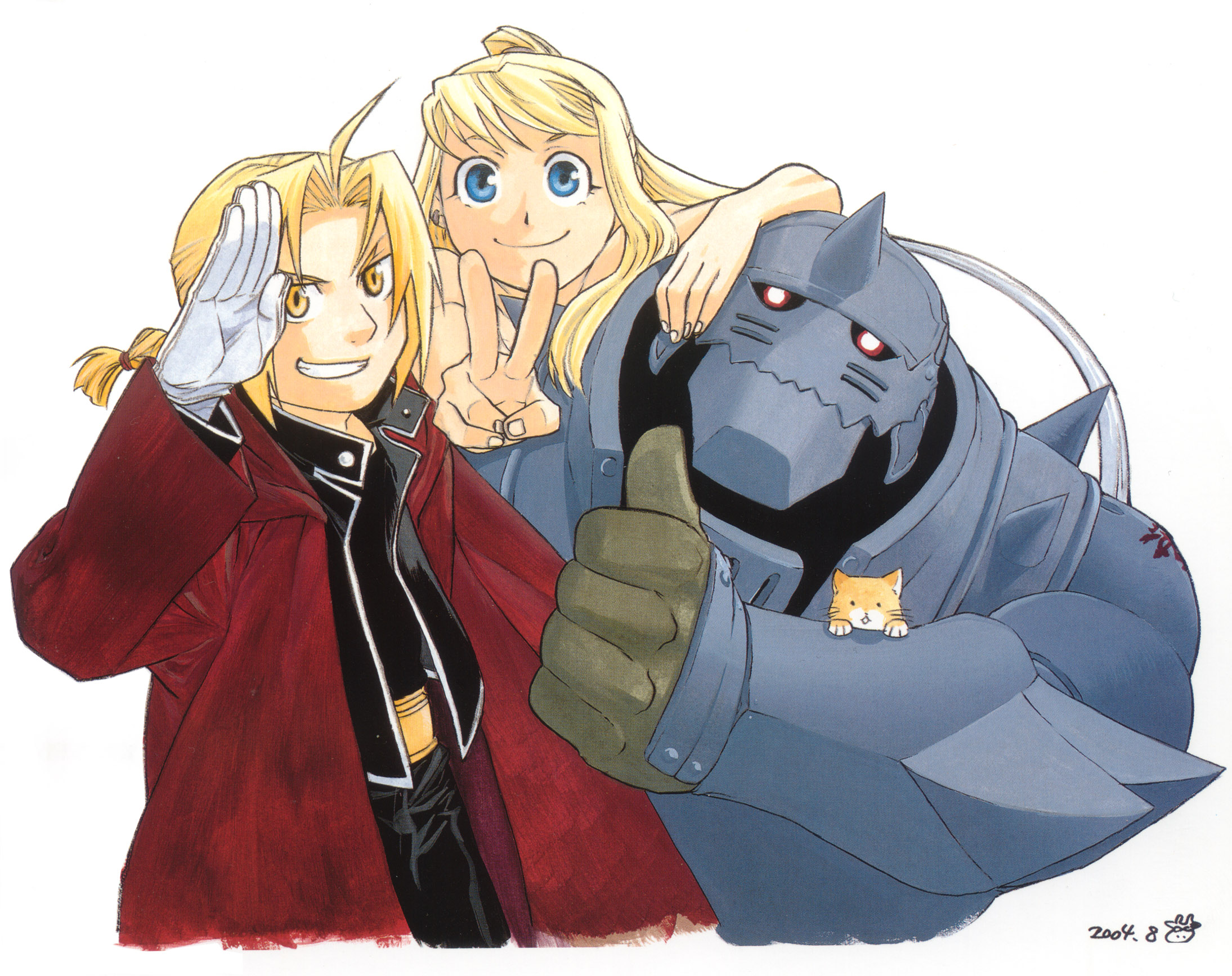
The first of these, Hiromu Arakawa, is a Japanese Manga artist who wrote and drew my favorite Manga/Anime series, Fullmetal Alchemist.These next two pieces are hers: 
I love how she depicts her characters, and her ability to tell a story both through word and picture is phenomenal.

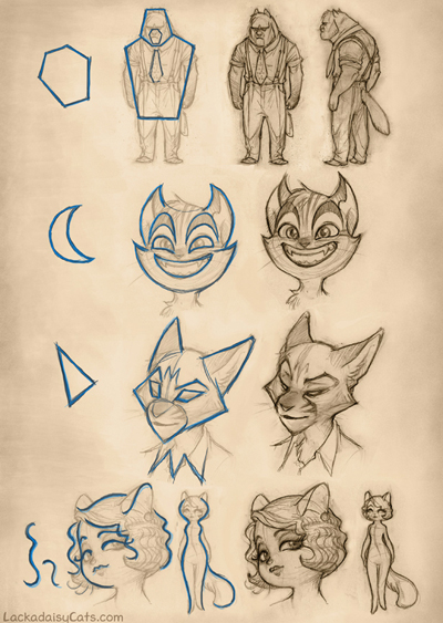
the next artist, Tracy J. Butler, works at a video game studio in the midwest and is also the author/artist of a webcomic called Lackadaisy. I greatly admire how polished her style looks, and how she can so clearly get a character's personality across with how they look. Plus, she also has a lot of extremely helpful tutorials. These next three pieces are hers:


The last artist I mentioned is Shamine King, who is another art student studying at Lasalle College of the Arts. She is studying animation and character design, two things I'm really interested in. There's a certain quality about her work that I really admire. I love how fluid her characters' motions are, and how expressive their faces can be. It's a bit hard for me to find examples of her work, as her Deviantart Account is on hiatus. These next three pieces are all hers:


Example of Miss King's comics


So, after taking some time to look at which artists inspire me, I realized that they are artists who deal primarily with character design and storytelling. Also, all of them make comics. I'd never really considered comics that much before going to college, but now that I've dabbled in it, it seems like a perfect marriage between what I love to do most (Writing and drawing). Almost every bit of art I do has a story behind it.
Here is some more of my work, all of them either characters I've created for stories or for Pathfinder (a tabletop role-playing game similar to Dungeons and Dragons).


It's been a long time since I've worked with colors, and I'm hoping to get back into the swing of that this semester.