Wednesday, May 4, 2016

Writing 5 (blog posts) Artist Lecture

"Zoe - Age 8" By Gwen Walstrand


Gwen Walstrand's work in photography mainly deals with portraiture. She showed us many series of her work, but the ones that stood out to me most were those she titled "Between." They consisted of photos of preteens, and a few kids who were slightly older or younger than that range. Something about the way she photographed them really captured that feeling of being a preteen. The one that stood out to me the most from that series is:

"Elizabeth" by Gwen Walstrand
Just something about this portrait really jumps out at me. I think it might be how much the darker background makes the pale girl stand out that much more. She's also so thin and fragile looking, yet seems to have some sort of strength about her face. I usually don't care for portrait photography, but this one really stuck in my mind. I also really liked her series of photos from Italy:

"Italia - 102" By Gwen Walstrand
Ms. Walstrand has a knack for conveying personality and character with her subjects. As for her work with Ms. Perkins,  Ms. Walstrand said that the town was "...Interesting, it's like everyone walked out all at once." During her talk she told us more about how racial tensions had destroyed the town. Many violent acts had occurred there, including a lynching. This fighting destroyed the town and left it as the shell it is today. Ms. Walstrand did take some interesting photos of the town, but I didn't find any of them as engaging as her portraiture.

She said she was inspired by searching, the unknown, navigation both physical and spiritual, and said that it was likely a reaction to her strict religious upbringing. She also recommended a book called "A Field Guide to Getting Lost" by Rebecca Solnit. I've googled the title and it looks like a book I might have to check out once everything settles down from finals and graduation.

Thursday, April 28, 2016

Writing 5(blog posts) for Crit 4

Last time it was suggested that, in order to add a bit more context and clarity to the world these characters live in, that I should include environment shots with the next batch of character designs. Not gonna lie, I really hate drawing scenery. I get frustrated with it easily. But I buckled down a couple weeks back and made myself practice. Here are the two I'm bringing to Critique (In rough stages):


This first one shows the New York City skyline as it looks after the merging of our world and the fantasy world. It was my hope that this would show my idea of how the worlds spliced together, and the dire consequences it sometimes had. In this world, it's fairly common to see the skeleton of some poor creature or human sticking out of an object or wall. This is due to that poor being's bad luck of being in the wrong place during the merging.

The second shows a coffee shop owned and run by fairies. In this world, there are many different fantastical races, and I wanted to show them mingling with modern humans to show how the two worlds integrated.

As for my character designs, I'm bringing three more.


The first one is Dagny, a faun who has the element of earth living inside her. She's very quiet and naive, but fiercely loyal.


 Tyler is the vessel for the Water element, and being of an artistic persuasion he has learned how to use his talent to work in watercolors.

Even though I'd drawn Cyth recently, I wanted to draw him again after he becomes the vessel to the wind element. His zipper eye was also pretty hard to see in the last picture, and I wanted an excuse to draw it. It's fun. :)

For my classmate highlight this blog entry, I'd like to direct your attention to Robbie Raio:
https://robbyraio.wordpress.com/2016/02/04/crit-three-introduction/
He's super talented with ceramics and jewelry making, and has a great sense of humor. He just recently started combining wire-wrapping techniques with ceramics, and it looked really cool. Hopefully he keeps pursuing that new combo.

Writing 5(blog posts) for Crit 4

My last critique held some really good feedback. I got great reviews on my tanky demon, with people saying they could really 'feel' like he was three-dimensional. For my last critique, I've decided to design four essential characters for my story, using what I've learned over this semester.

Here are my versions of the Four Horsemen of the Apocalypse:

  
Pestilence - The White Horse    
Starting with Pestilence, I was inspired by the plague doctor masks made infamous during the black death. I wanted to have a very limited color palette, so as to avoid the 'children's book illustrations' feel that some of the other monsters had when I used watercolors. I used copic markers instead, in very small areas to draw attention to them.
War - The Red Horse
 War was my favorite to draw, as its horse body is based on a Clydesdale, which is one of my favorite types of horse. Again, I wanted to have a very limited color palette.
Famine - The Black Horse
 Famine was not a fun design to do research for, since I had to look up what emaciated horses look like. I'm pretty pleased with this design, though.
Death - The Pale Horse
I didn't want Death to be 'in your face' scary, but maybe a bit more subtle.  I also didn't want it to be a stereotypical skeletal horse, since that's always what I see this Horseman shown as. When I looked up the original Bible verse, it describes Death as riding a pale horse, which could also mean grey, so I gave it the frame of an Arabian horse and slight dappling. The design for the scythe was loosely based on a Stephen Gammell illustration:
Stephen Gammell - "Bess"
I decided to make them all centaurs since I'd never seen that done with the Horsemen of the Apocalypse. I guess it's just a much more literal interpretation of "horsemen." :)

I'm really excited to see what everyone else has brought for the final critique, and I'm interested to hear what people think of the Horsemen I designed. I'm also looking forward to seeing what Darah Dawn Miller has brought, as I find her art style really interesting. You can find her blog here:
https://darahdawnmiller.wordpress.com/2016/04/07/writing-4-blog-posts-for-crit-3/
That clay octopus is one of my favorite pieces she's brought so far. The mouth that's visible faintly reminds me of Ukio-e prints, and I wonder if she's ever thought about continuing that motif. It could look really cool.

Thursday, April 21, 2016

Writing 6 (blog posts) Artist Lecture

Sarah Perkins, "Winged Container"


What first struck me about Sarah Perkins's work was the graceful nature of her sculpting and metalwork. At first I thought it was ceramic, but was surprised to learn that it was mainly metal. The above pictured vessel was one of my favorites she showed. I love how the colors transition from blue to brown, it produces a very soothing effect. I also like how the silver stands out from the blue, and how swirly the designs around the brim are. During the Q&A session she mentioned that she started out with jewelry in High School and it shows with intricate designs like the swirls. During her talk she said she was inspired by nature and the world around her, and I can definitely see where that influence comes in with pieces like this:

Sarah Perkins, "Cactus Container II"


Her work has such a great tactile sense to it, I really want to pick it up and touch it. She said she sometimes achieves this effect by taking the gloss out of her final products, as she usually finds pieces with a high amount of gloss uninviting. She said her work was about a mixing of human and organic (straight lines vs. curvy, etc.). An example of that concept is shown in this piece:

Sarah Perkins, "Orchid Vessel"
The Orchid Vessel mixes straight, rigid lines with the softer, organic shapes of the top rim. She says she's really drawn to the form of the vessel. Another thing she mentioned interest in was the concept of 'ritual' things, and how they can be intriguing and also make one feel like an outsider if the object's purpose is unknown. She cited many trips to churches, mosques, and other places of worship and mentioned how interested she was by the ritual objects displayed there. Taking that inspiration, she creates works like this:

Sarah Perkins, "Rosewater Itradan"
In the vessel (Called an Itradan), there is usually some kind of liquid (In this case rose water). And each cup has a special pigment in it. Each cup means something, and even if it's not known what they're still interesting to look at. Ms. Perkins has actually made several series of cups which she says she wanted to be, "Similar, but not identical."

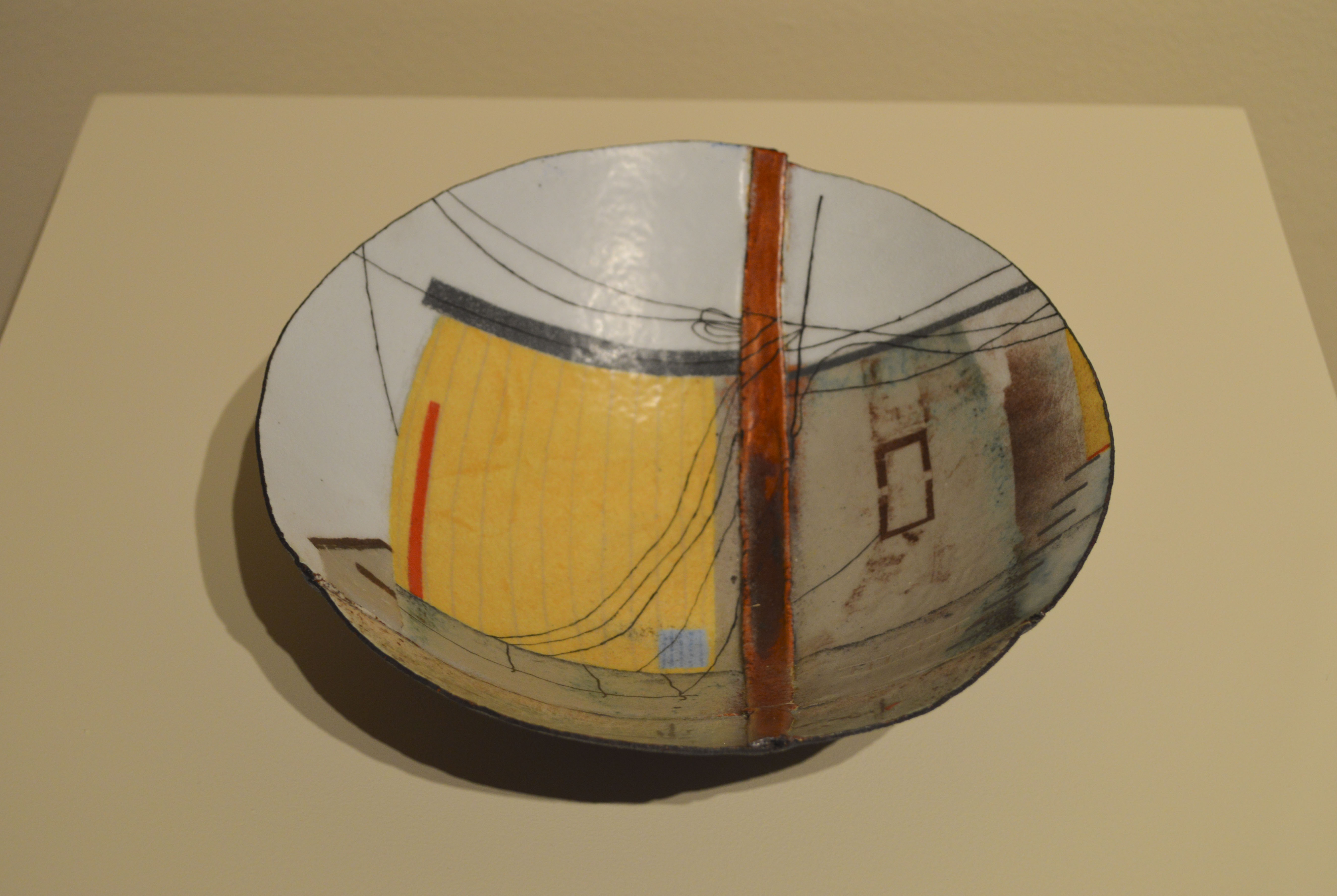
Ms. Perkins ended her talk by speaking briefly about Cairo, Indiana. Cairo is a town by a river that has fallen by the wayside and into deep disrepair. Perkins has teamed up with another artist, Gwen Walstrand, to produce a series of work based on photos taken of the town. Perkins's contributions consist of large bowls with scenes from or inspired by the town re-created on them.

Sarah Perkins, title unknown
Sarah Perkins was fun to listen to, and seems like a very lively person. Her work was very nicely presented and her powerpoint was simple, and uncluttered. Therefore it was very easy to follow and did lend a more professional feel to her presentation. I looked at her website to see more of her work, and among other pieces in her gallery I think I found my favorite:

Sarah Perkins, "Black Lined Container"
I really like how smooth this one is, and I've always been a fan of black, silver, and blue together. The blue enamel against the black is so pretty, and it's just enough to make it a wonderful accent color. I've always loved containers, finding that the more ornate they are that they often hold a greater degree of mystery. While this vessel is far from the most ornate that Perkins has produced, to me it's the most intriguing.

Thursday, April 7, 2016

Writing 4(blog posts)for Crit 3 (Crit II)

I got some good feedback last time, and I think part of it was that the group was good about keeping in mind that the demons were meant to be seen as designs, and not finished art pieces. Portico suggested I try doing a bit more gore; having the demons have some "evidence" of their activities. So, here are the three I've got to show on Friday:

I wanted to draw a big tanky demon, with some influence from Stephen Gammell's work. Since last time it was mentioned that the color made my demons almost 'cute' I wanted to try black and white with some sparse color.
 My second design was prompted by wanting to do something a bit more human looking, but still unsettling. I used the same coloring idea as I did in the first design.

Taz is actually going to be a pretty important character in my webcomic, which is why I put a bit more work into coloring him. In the story, he's a fallen angel who is a member of a small band of demons who want to seek redemption and be allowed back into Heaven. When he initially shows up in disguise at the main character's house, they reveal his true form and try to trap him. Unfortunately all they have on hand when they work the spell is a Gatorade bottle. So he gets shrunk down to that size. Eventually, once he proves that his intentions are good, they'll put him in an old turtle habitat so he has a bit more room to roam.

I'm really curious to hear feedback on the first demon, as I tried a few new inking techniques with it. 

This time around I'd like to feature Will Cowley:
https://willcowley.wordpress.com/2016/01/29/information-about-myself/

I really like that his work has elements of stage magic in it, as I've always been a fan of that. I don't see any examples of it on his latest blog post, but the last couple of critiques he's brought in drawings of little voodoo dolls that are creepy cute.  I wonder if he's ever thought about taking one of those voodoo doll drawings and turning it into a sculpture? I think some of his works could look really cool in that format.

Tuesday, March 29, 2016

Writing 3 (blog posts) for Crit3

Last critique I got a lot of compliments on my character design and some good advice on my environment sketch. I don't know if I'll have the latter completed by Friday, but hopefully I will. So far, I've got these two ready to go:


Both are characters from a story of mine where Earth has merged with another dimension that was a fantasy-styled world, resulting in magic (among other things) suddenly being introduced to the modern age. The first, Vivienne, has the embodiment of life energy living in her, and Belvedere has fire (much to his chagrin). It's been really fun to figure out what that world would look like, and to puzzle through how different parts of our society would react to it. 

I'd like to have at least three character designs from this world to show on friday. Here's what I have so far of the main character:

 
He has the embodiment of death living inside of him, and I've been trying to figure out how to convey how his power looks in my head on paper. I know he has the ability to make shadows rise off of surfaces and become solid, but I'm not sure how to show that yet.

During the merging of worlds, if a human from earth happened to be standing in the same location as a creature or object from the other dimension, the two would fuse together into something called a Chimera. More often than not, the Chimera would die instantly or shortly after its merging, but sometimes they survived. Sometimes this merging would result in a harmonious fusion of the two beings, but usually they're left horribly disfigured (extra limbs poking out of chests, two heads, and so on). They're social outcasts from both worlds due to their condition, but a faction has risen up comprised of surviving Chimeras that offers shelter to them. The leader of this faction is Alastor, who I'm trying to sketch down below:


He's been the most frustrating to draw so far, as I can't quite get him to look like how I want him to.  Since there's so much backstory to this world, I've thought about writing out a short synopsis and putting it with my drawings during the critique. 

In this latest batch of character designs, I've tried to focus more on a variety of body shapes and more fluid poses. For the latter, I've been studying an artist on Deviantart known as Kate-FoX:


I really admire her range of styles, and she has some really helpful pose studies and tutorials. I think I need to practice more, especially with hands and fluid poses. I'll try to make some time for that this week.

You should also check out Molly McVey's work:

I'm not usually a huge fan of black and white photography but some of her photos are really stunning (I particularly like the one of the chandelier).  I wonder if she's ever thought about leaving her photos mainly black and white, but then having a small part of it be in color (Or vice versa)? I see in her writings that she admires photographers who can convey story in an image, and I think that color can be an extremely useful tool in that aspect.

Tuesday, March 22, 2016

Writing 3 (blog posts) for Crit 2

Time for round 2 of demon designs for my webcomic. To be honest, I was frustrated with how the last critique went. My fellow students didn't really seem to listen to me when I said that the three were meant to be designs and not "art pieces". I wanted feedback on if they were scary or not, and how to improve them. They wanted each to have a backstory, which I can understand for more important demons (Of which there will be a few). For those, I do have backstories because they're involved more in the story and need to be more developed character-wise. However, these monsters I'm designing for class are meant to be 'monsters of the week.' They will appear, be scary, then be defeated, probably to never show up again. It felt like I repeated this dozens of times but nobody listened and continued to look at the designs as art pieces, which isn't how I'm intending these to be taken.

Here's what I have so far. For these, I used ink and watercolor pencils.


Carlie Gernhart- Demon Design 4
  
Carlie Gernhart - Demon Design 5
 
I intend to have at least one more demon design by friday.  These are still oddly therapeutic to work on and are a great stress reliever. :)  While I've been looking at Stephen Gammell a lot for inspiration, I've also been browsing around the web. I've found an artist on Deviantart who goes by the username Atenebris who has amazing and creepy creature design:

 
Shamo by Atenebris 

Rigel by Atenebris

 
Kitty by Atenebris

I love how elegant and intimidating the first two are, and the eyes on the third make me want to play around with lighting effects more. It's also interesting to me how the last picture uses a color range not usually associated with scary things (it seems to have a cooler, cyan-ish tint to it, with a bit of magenta).


This week I'd also like to draw your attention to the awesome work of Mattie Parrigon:

I really like her portraits, and like the sketchy quality her lines. Her series of nursing home portraits are my favorite of her works that I've seen so far (I'm particularly fond of the picture of the old man with the tattoos). 

Saturday, February 20, 2016

Writing 2 Blog Post for Crit 2 (Critique III)

In my last critique, I got a lot of good feedback on my original character designs. I'm supposed to push volume more, try out watercolor pencils, get a definite light source, vary body types and faces, get distinct motions down and not be so hesitant in my line work. I'll try to have some new Character designs ready for the next critique, but I'll also have some landscapes.

Backgrounds have been my least favorite aspect of drawing, as I get frustrated with them quickly. Lately I've been forcing myself to draw them and practice. Here is an in-process sketch of one I hope to have ready to show by next critique:

Since I want to be a concept artist someday, the more I can confidently draw the better; character designs, backgrounds, items, and more.

Another one of my classmates that I'd like to feature is Jaqueline Denton:
http://jacquelinedenton.blogspot.com/2016/02/writing-blog-posts1.html
I'm a fan of bright colors, and she definitely uses them. She does psychedelic art and I think is very good at using her medium of choice.